MSquared — Rewriting the rules of reality
— Services
- Brand Strategy
- Brand Identity
- Design
- Tone of Voice
— Collaborations
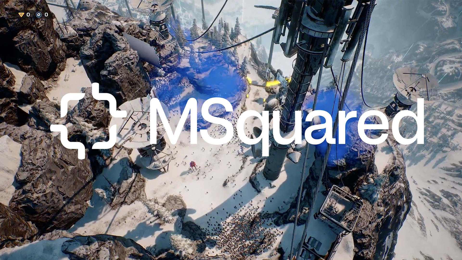
Play full video
Introducing MSquared
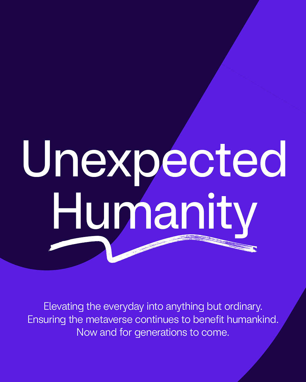
Bringing ‘Unexpected Humanity’ to the Metaverse.
Leveraging Improbable’s Morpheus technology, together with components of Web3, MSquared builds, operates and services new virtual worlds for other businesses in its open metaverse. The metaverse may seem complex, their mission is simple: To bring about meaningful, valuable, and lasting virtual experiences.
How? By providing innovators and creators with the network, governance and commercial structure to support the connection of metaverses and the interoperability of content across linked worlds. To bring MSquared’s vision to life, we developed a brand attitude & principles delivered across various brand expressions from the logo and custom typography through to marketing assets, corporate livery and more.
The Challenge
Articulate Improbable’s vision of a truly interconnected metaverse, powered by their own technology, MSquared.

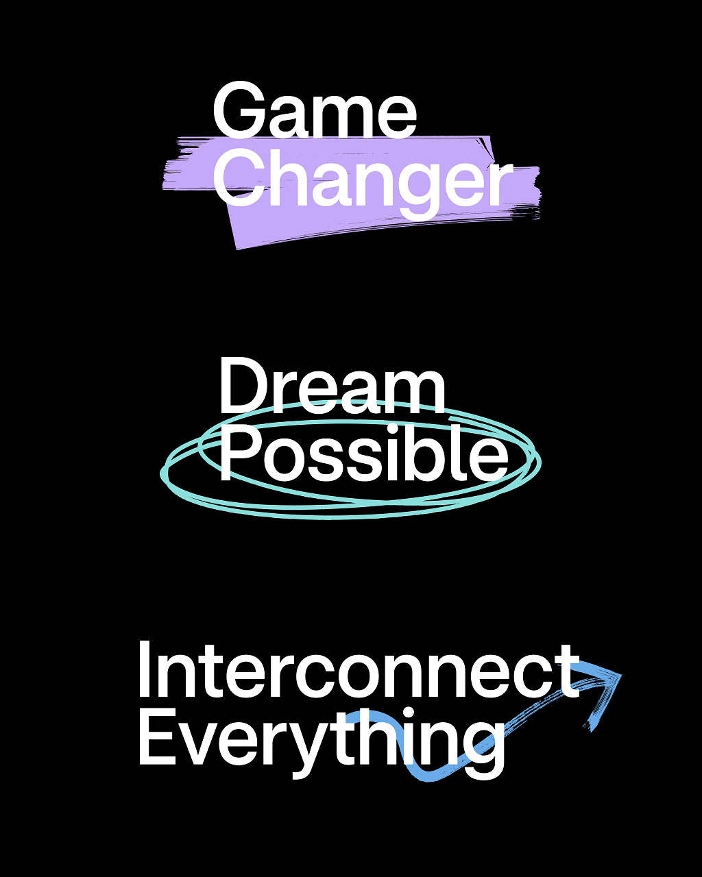
We developed a brand attitude of ‘Unexpected Humanity’ to demystify the confusing vernacular associated with the technology and brought it to life through various brand expressions underpinned by four design principles; interconnectivity, ownership, playfulness & community.
In a category marked by cold, overly-technical and exclusive brands, we built the MSquared brand around the people behind the technology.
‘Unexpected Humanity’ became our Brand Attitude, the guiding light for how the MSquared should look and behave. This was then underpinned by four design principles: interconnectivity, ownership, playfulness & community.
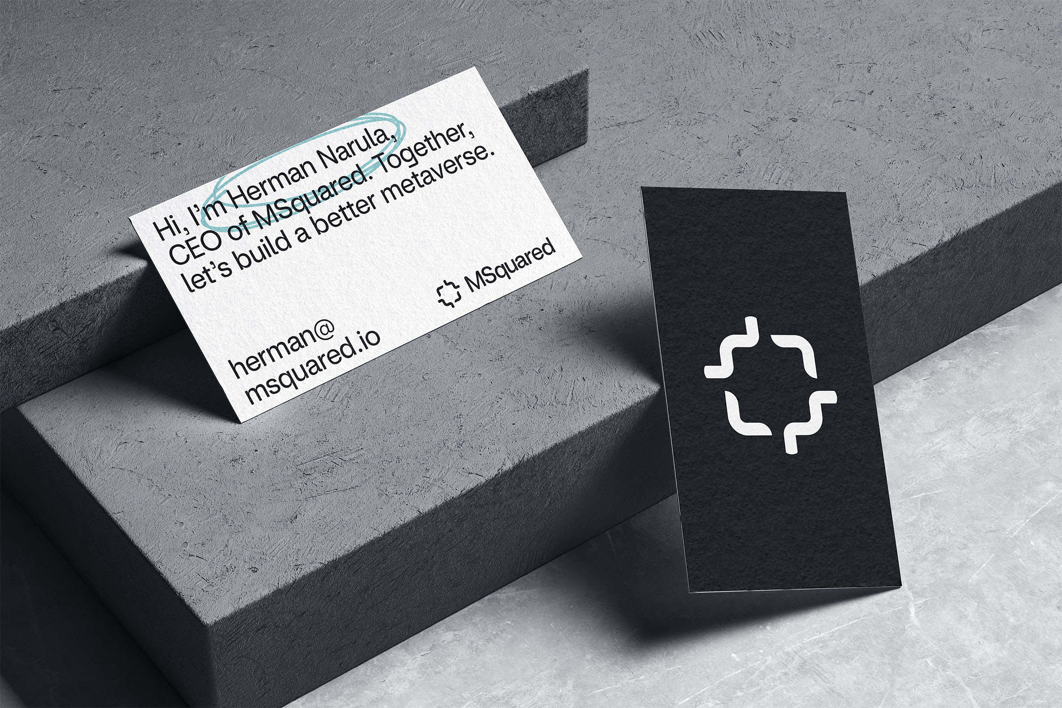
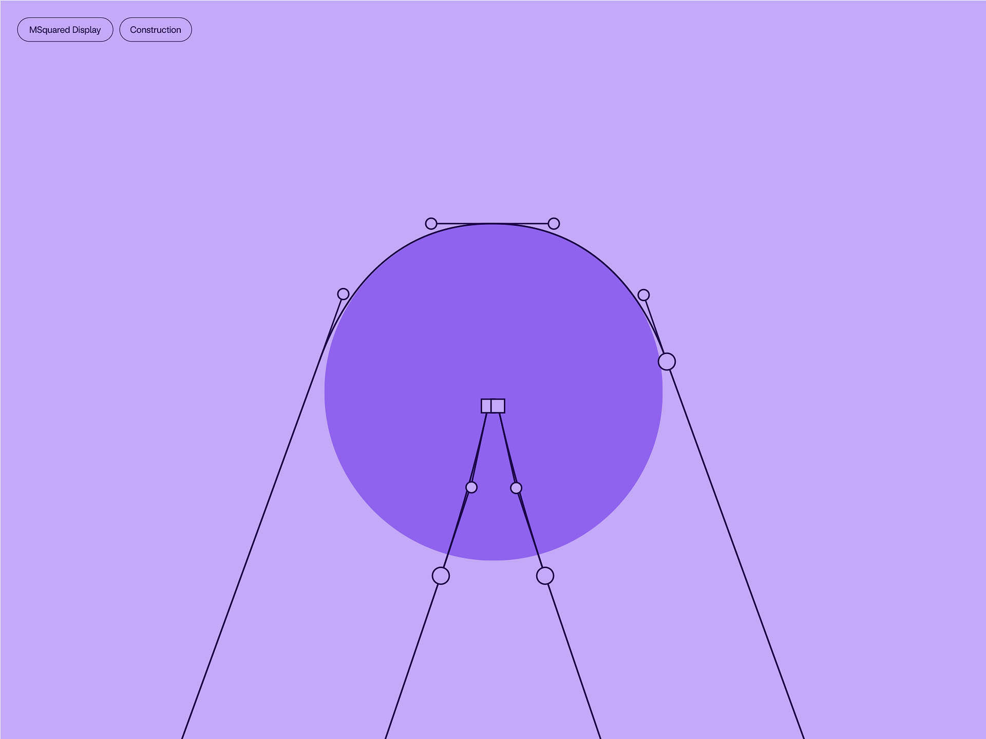
With these guardrails in place, we developed a simple, scalable and bold monogram that expressed these principles and whose traits could be used across the rest of the design system.
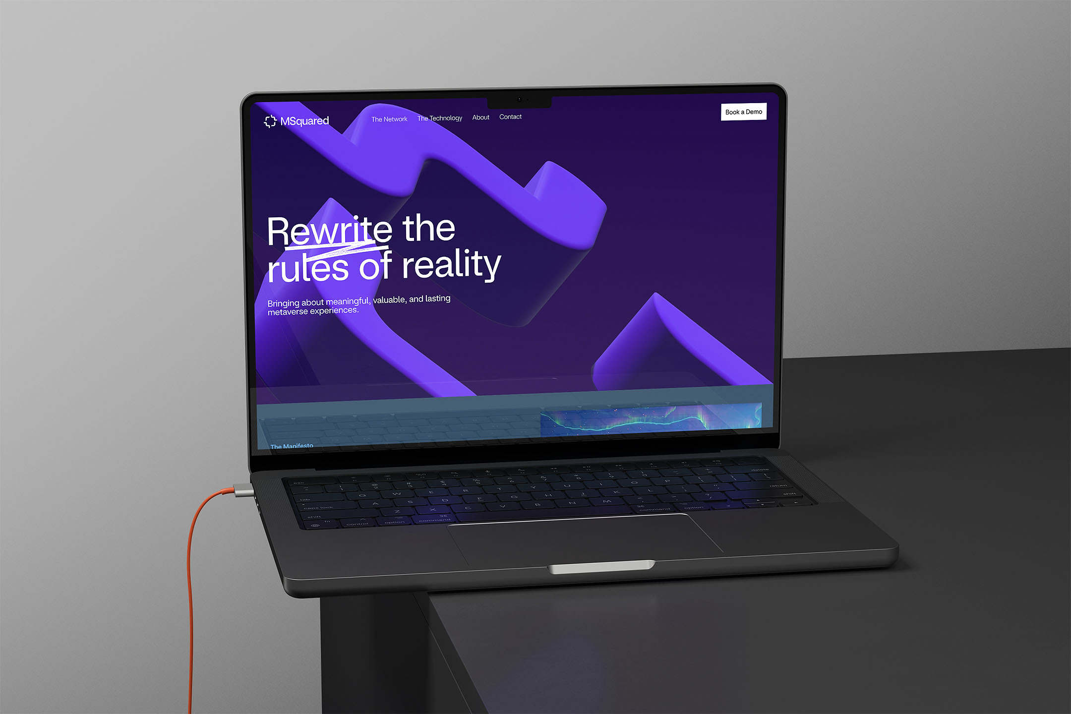
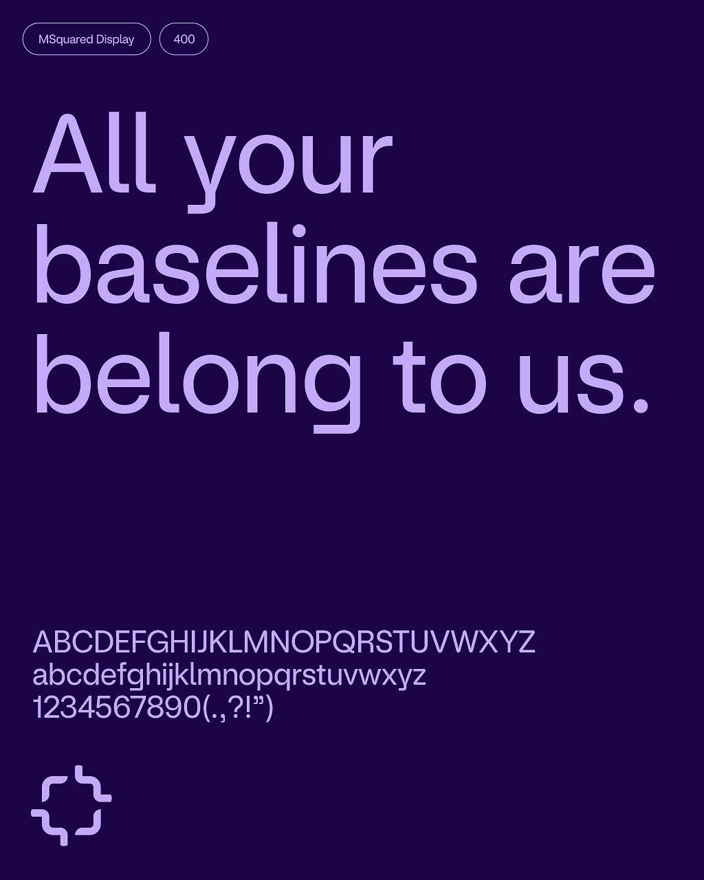
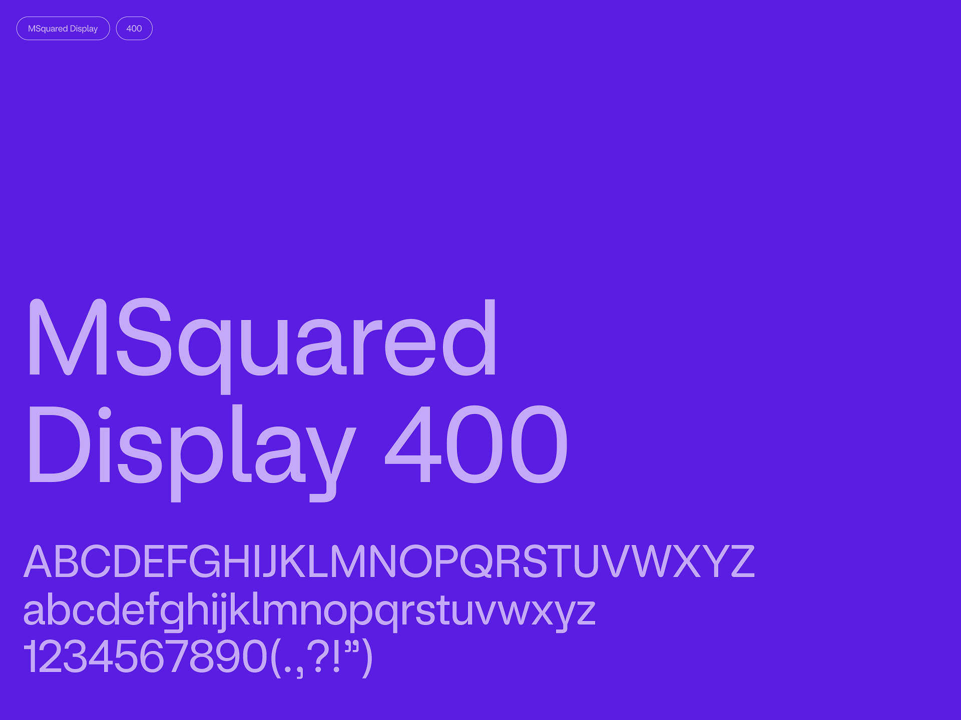
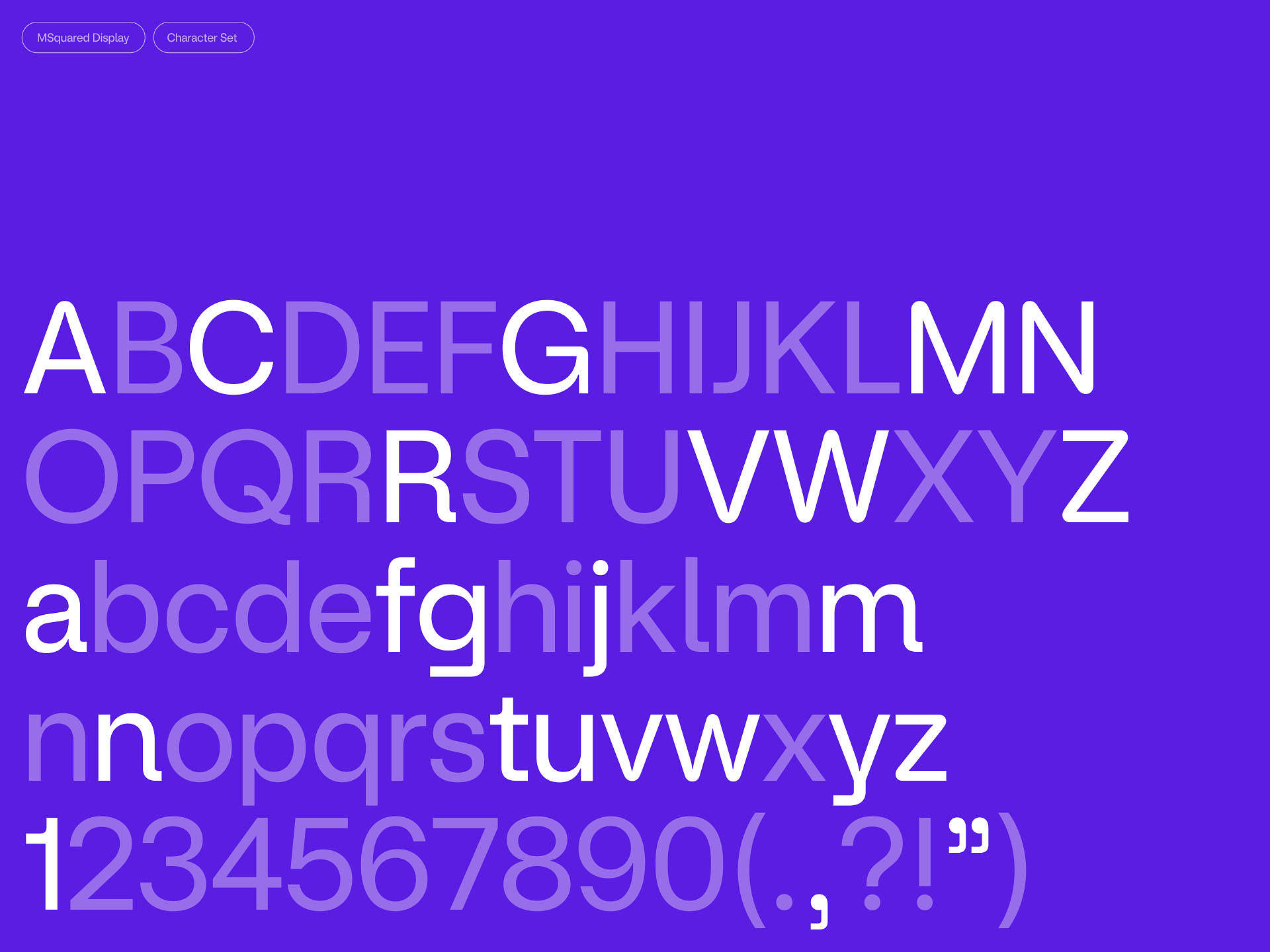
The playful curves from the monogram were a direct influence on MSquared Display — the bespoke typeface we created in collaboration with Family Type.

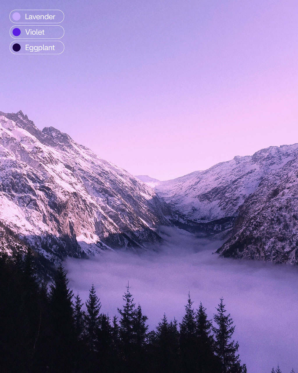
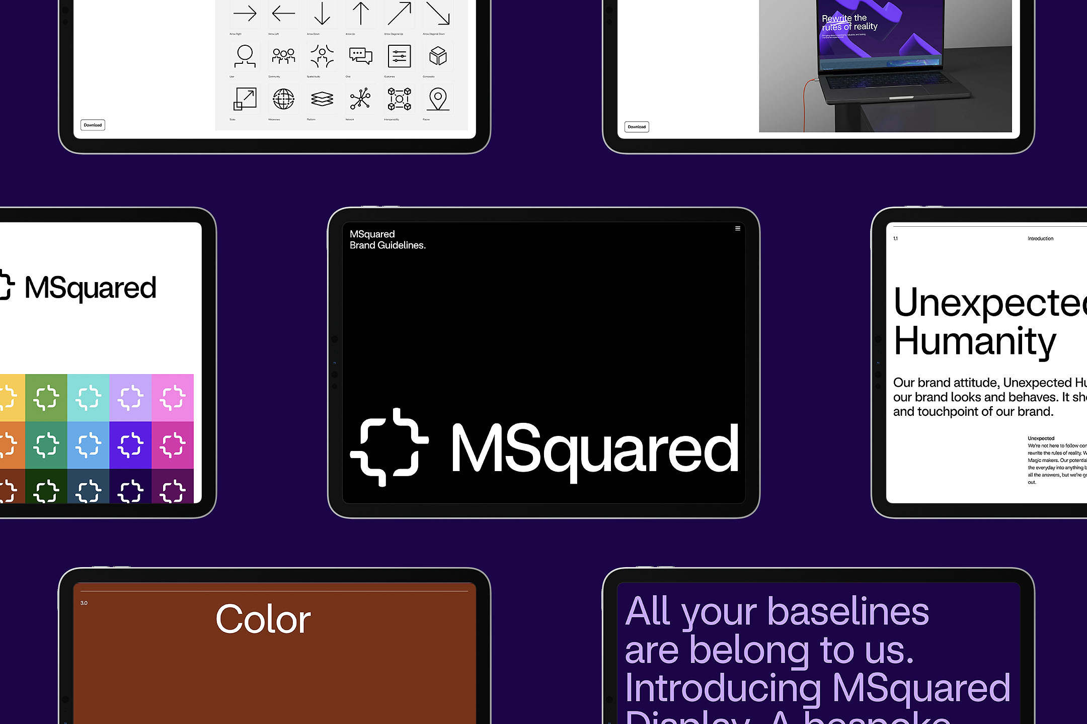
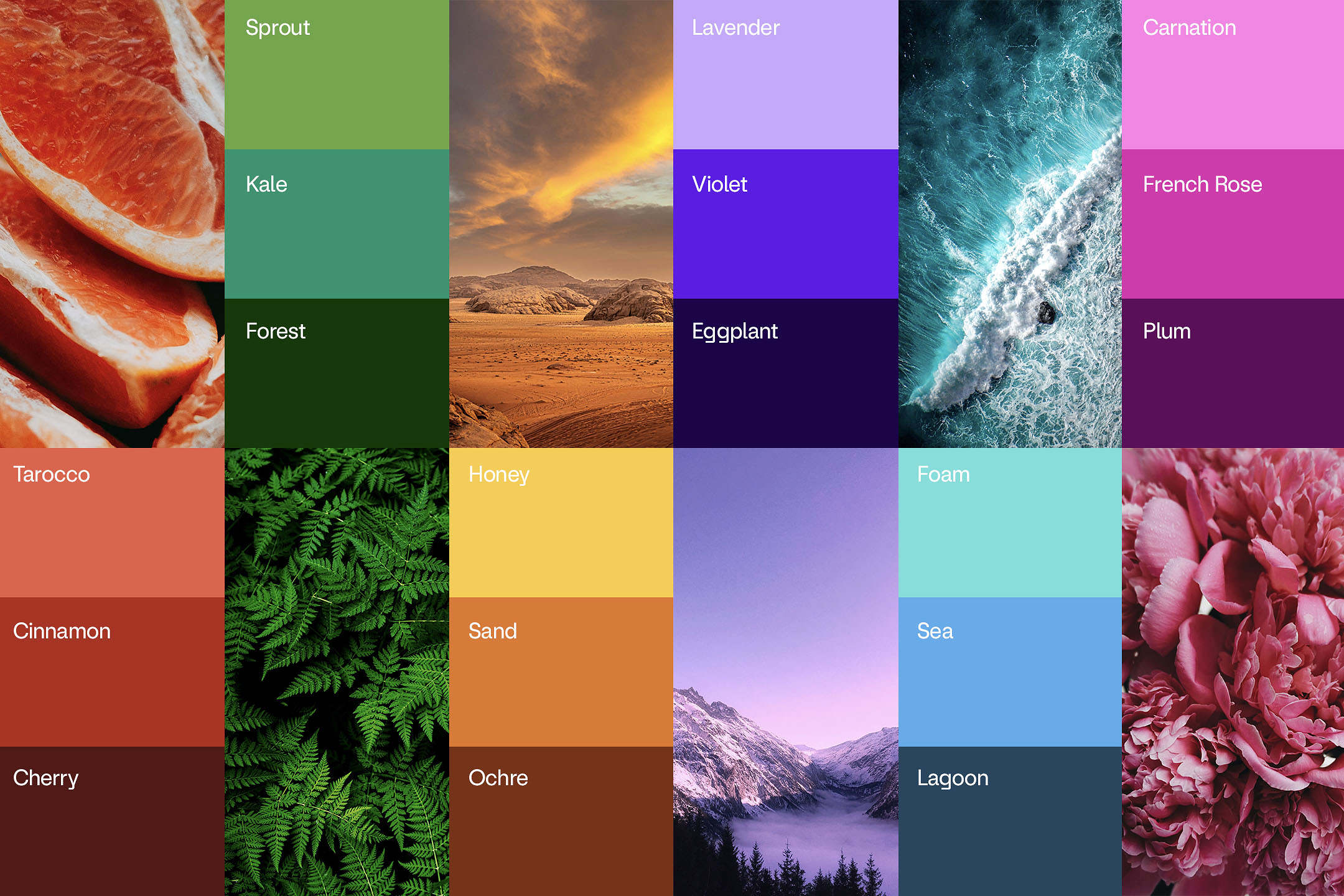
Rather than stick to the conventional digital-native palette, we took inspiration for MSquared’s brand colours directly from the natural world.
With the brand facets in place we then took to the wider identity, developing a range of brand motifs that could be used in various ways to expand the visual language, adding variety to communications.
We introduced a series of scribbles and marks that gave the brand a real human touch and expanded further, developing a series of patterns and holding devices that reference the monogram.
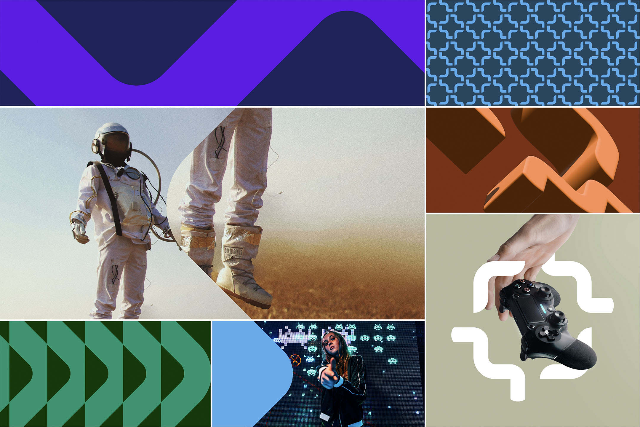
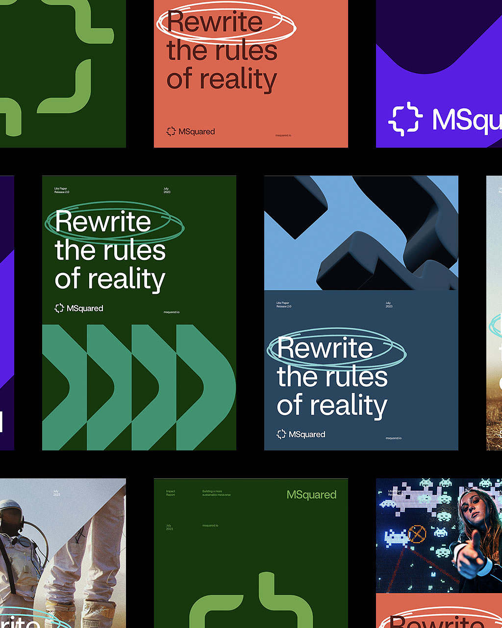
All of these elements combine through every brand expression – sitting on a pixel-inspired grid for consistent but expressive layouts.
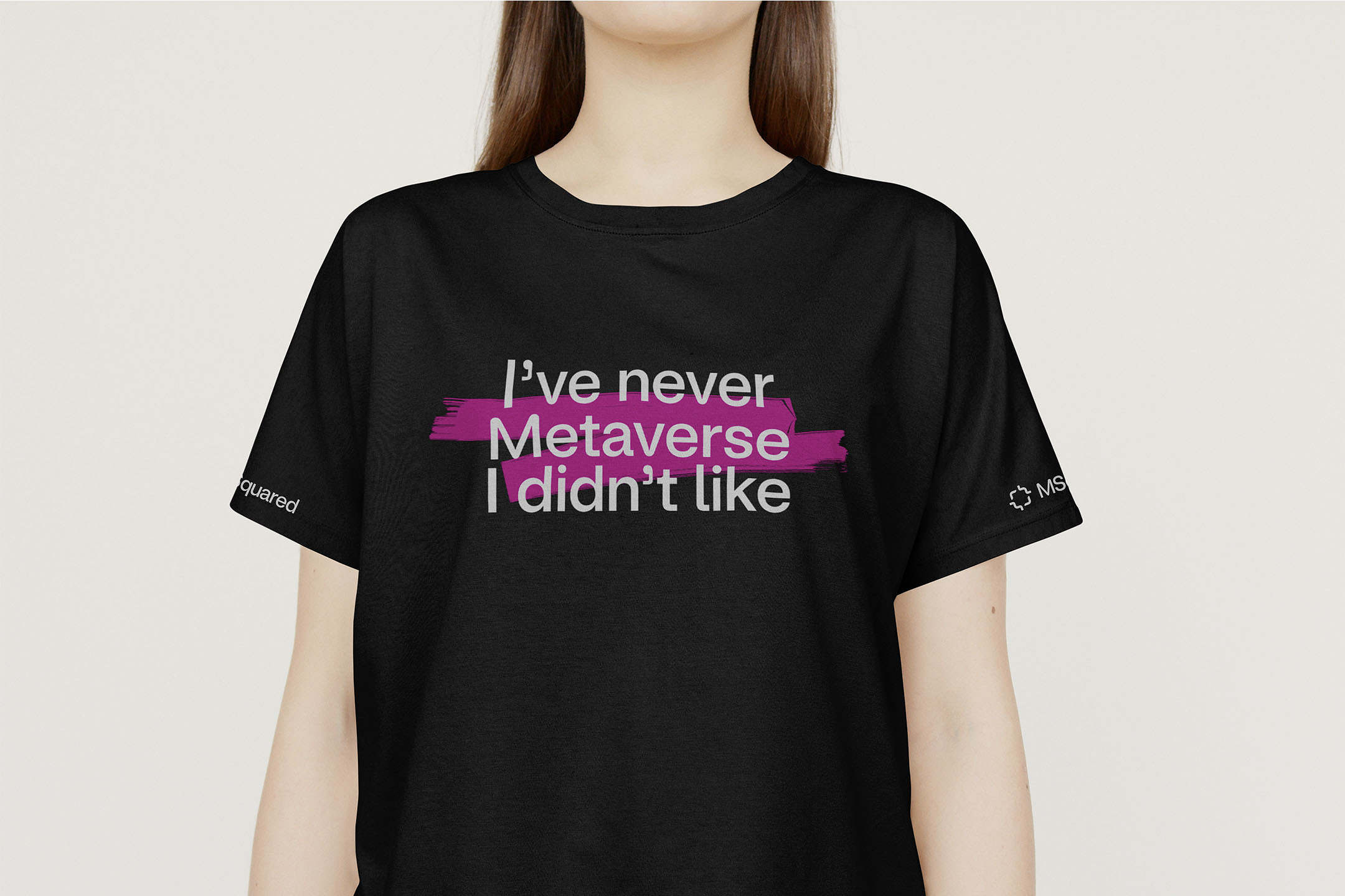
A down-to-earth, straight-talking tone of voice completes the whole identity, setting it apart from other brands in the category.